
Design systems and designers always have had a love-hate relationship. You can argue that design systems will add more restrictions to a project or a feature and don’t leave much room for creative exploration and expression. Not to mention restrictions from user experience patterns or operating systems giving the impression that all apps and websites look the same.
At Undo, we disagree. On the contrary, we use design systems as a framework to create more room for creative exploration and actually stand out from the crowd. Let me dig into how we do this.
Startups are known for rapid change, pivots, and in general a lot of chaos. Undo is no exception. Together with an ever-growing team, designing things on the fly became less and less sustainable.
It became more challenging to keep all the stakeholders in the loop but more importantly, get the right design feedback at the right times. Not to mention all the context switches that came with it in between. So, as someone that needs a lot of structure to be able to think clearly, I identified the need for a clear design process.
Based on the 5 planes of UX, I started to structure all the steps it takes to go from a wild idea to a functional and user-friendly UI with structured design critiques and user testing in between. This process helps us now to translate abstract ideas into very concrete UI components. Jesse James Garett introduced this framework for web design but it has been applied in the industry to all platforms in digital product design.
Above our interpretation of the 5 planes of UX in the process of structuring it to a design process.
In hindsight this was both a good investment in terms of process and practicalities, but more importantly it created a common language across all stakeholders involved in a project.

Undo’s design process in a nutshell
Design critiques are held with all stakeholders and the design process went from being a backbone to steer our design projects to a cross-functional tool to ideate and execute all our features. The high cross functional involvement might seem a little controversial in some design teams, but has proven to be very valuable in terms of the further development of our features. The extensive involvement of stakeholders allows us to stay ahead of technical, legal and operational challenges we inevitably face in the insurance industry. But as the product team grew in engineers and the pace went up again, our design process still served as a good foundation. However, things needed to be cut short and more compromises were made for the sake of speed. Lack of time for co-creation, user testing etc forced us to only use the bare bones of our process and the design team (still only consisting of 2) had to cut corners to be able to keep up. Design quality dropped, the feeling of ownership dropped and the overall team spirit dropped. Not good.
First off, it was time to revisit our design system. We already had one set in place, but as the product grew it made sense to add our new components so we could ensure a consistent user experience without too much effort within the short timeframes we had to produce.
Alongside new components, it was also a great time to update our existent components with Figma’s new auto layout and responsive features. For more about this you can have a look at one of my previous articles about design systems.
Furthermore, it allowed us to spend less time on repetitive designs and more time on the touch points that matter. This is exactly where the psych curve comes in.
The psych curve, or psych framework is a user psychology framework used to increase conversion. Darius Contractor introduced this framework at Dropbox, and we picked this up after seeing how it can also be applied on other products and flows such as Air BnB’s onboarding flow. In a nutshell it is an assessment on how “psyched/motivated” users are in each step of a flow. It could be an onboarding flow, a purchase flow, or any flow in a product. Apart from it being an assessment tool, it can also be used as a benchmark to improve on the touch points where the psych drops.
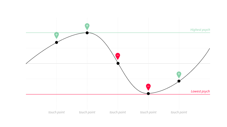
“Every touchpoint increases or decreases Psych, the unit of measure for motivation to complete an action. “ — Darius Contractor
When we first started applying this framework, we quickly realised that the moments in the flows with the highest psych differences are often touchpoints that require extra resources — in other words, touchpoints that are expensive to design and/or build.